As a maker of digital content, you want to communicate something to your audience through the stories you weave. Whether that’s helping them understand a concept, making them feel an emotion, or mounting an argument, you want them to create a connection. You can help divine meaning from your work by dividing it into intelligible chunks.
In this article, I’ll focus on the arrangement of words in digital content. I won’t cover granular topics such as sentence formation or word choice. Rather, I’ll hit on the larger units that shape of the story: the frame, story structure, paragraphing, and headings.
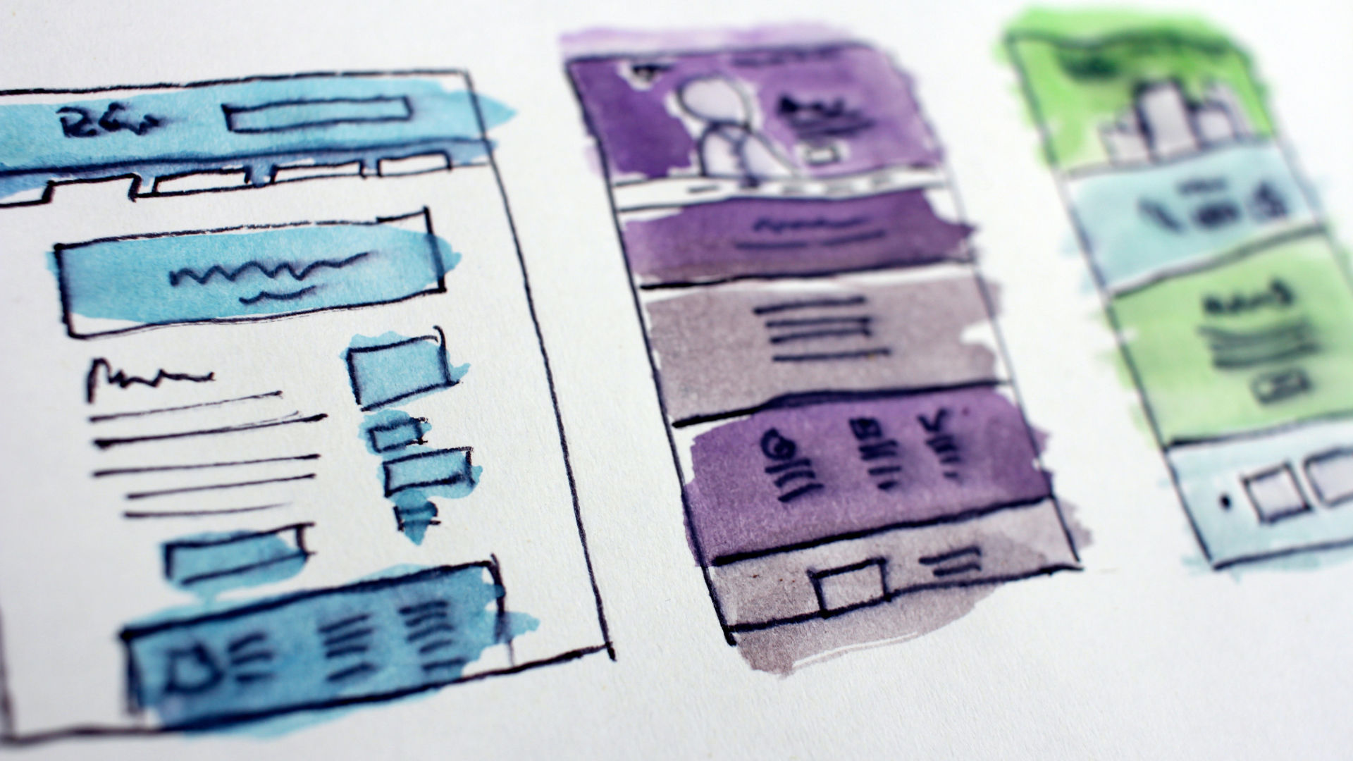
Why Chunking Matters
In cognitive psychology, a chunk is “an organizational unit in memory.” Chunking refers to the process “by which individual pieces of an information set are bound together into a meaningful whole.”
Chunking is often used as a memorization techinque because it breaks down information into discrete pieces that can be reassembled or cobbled into something new. The most common example of chunking is the way we break down phone numbers for memorization (back when we committed things to memory). We do this by grouping the numbers then reassembling them into a coherent whole.
In digital content making, chunking is the creation of smaller units of information. Chunking reduces the cognitive load on the user, promoting comprehension and memory.
Chunking works because humans like shortcuts. We’re adept at developing them. To combat information overload and short attention spans, users scan, skim, and skip digital content, scarfing it down like a sack of grade-b tacos at 2 am.
When someone comes to a page, they scan the page for markers that identify the areas they want to spend additional time (or it will help them determine the worthwhile level of investment). They’re looking for things that jump out to them, like headings and subheadings, bold text, and bulllet points. They may even read the first few paragraphs, but they’re unlikely to go beyond that unless you give them a compelling reason to do so.
Get in, get out, and get on with their lives.
How much tolerance users have for your content is determined by their context. For example, if I’m going to the site for the Paris Review or The Atlantic, I’m willing to spend time sipping the content. My expectation is that it will be longer form and require a higher level of engagement. I’m prepared because I understand the context.
But if I’m trying to figure out why squirrels keep splooting on my back fence (it’s a thing), I’m looking for signs on the page that point me toward solutions. I’m trying to solve a problem in the shortest span of time possible.
While we don’t know the context the user brings, we can infer by the type of site for which we’re creating the content and adjust the approach accordingly.
No matter the content, we can entice readers to slow down and savor the experience, spending more of their precious focus on our ideas by giving them some of what they want, and more of what they need.
Frame: The Screen and the Page
On paper, the basic form of content is defined by the size, shape, and material of the paper. On the screen, the device dictates the shape – a phone, tablet, or laptop, whether in portrait or landscape. On a laptop or desktop, the browser dictates the shape, and we can resize the window into an almost infinite variety of quadrilaterals, but, on the whole, the rectangle is the dominant form.
This shape helps us focus on key pieces of information without having to be overwhelmed by the entirety of the piece. Imagine a novel printed on a single sheet of paper. No matter how you expand the canvas – whether wide or tall – the audience will be intimidated. But break it up into pieces, and you can power through your favorite 300-page beach read in a matter of hours.
Our brains are designed to filter, and the fundamental design of the rectangle facilitates this by acting as a view limiting device. It forces readers to focus on a subset of the information. The page of a book is fixed, while the digital page is an infinite canvas, but the screen forces us to focus on discrete chunks. Like the page, the screen (or the browser) acts as a view limiting device.
But what about the content itself?
Just as the rectangle breaks the work into intelligible bits, the design of the content itself can be chunked.
Story Structure
We don’t often think of the shape of the story as a method of chunking. But it contributes through the relevancy created by the placement of details in proximity with one another.
If the goal is to convey information or mount an argument, we want the audience to get involved and stay involved. According to studies, there are as few as 10-20 seconds to capture their attention. So, it’s imperative to choose words that catch the reader’s attention and compel them to read on.
Don’t count on summary techniques like TL;DR if you want readers to feel connection with your work. You need to get them in and engage with the content, eliciting an emotional reaction.
Experiences are impactful and better remembered when they’re tied to emotion. But getting to the emotion of it is tough if readers are bouncing out after a few seconds. For better results, consider writing your piece following the Iceberg Method.
The Iceberg: A Simple Approach to Story Structure
When structuring a story as an iceberg, the most important details are upfront, delivering within the first few paragraphs, an overview of what’s to come. Lay out the most important parts of the story and entice the reader to continue. Then, lead them below the surface as an expert diver and share the iceberg in all its underwater mystery and glory, unfolding the main points through specific details.
Journalism has a similar structure: The Inverted Pyramid. Long before the TL;DR, the inverted pyramid was a way to end with the beginning. The inverted pyramid is named because the end is at the top of the story (the lede). Beyond that, details expand the reader’s understanding if they choose to continue. The reader can bounce at any point and know the meaning of the story.
While dismissed as a relic of the past – a nostalgic reminder of the soon-to-be-forgotten era of newspapers – it maintains relevancy today. In a world hellbent on consumption of information, the inverted pyramid is a platter on which to serve content to be consumed. You can find it in use on blogs, newspapers, and magazines.
The Iceberg stands in contrast to the Pyramid because it compels readers to put on their gear and join the writer in a scuba adventure. A story built on the iceberg chunks the content in a way that makes it intelligible and easy to navigate and ensures the audience understands the meaning of the piece.
Paragraphing
When I was in high school, I completed a senior project, which included a thesis. At that time in my life, it was the longest continuous work I produced (except for 50 pages of a handwritten novella).
The project was a beast: we had to go into the community and shadow three different folks in different professions to learn about their jobs. We were expected to report our findings, reflect on the experience, and share the results with the class through a presentation and essay. The work consumed the second half of my senior year.
My project advisor was the school Athletic Director, a man with slightly unkempt hair and a mustache the 70’s would have been proud of.
I handed in my senior thesis for review – a checkpoint on the road to a final paper. It was a riveting work containing my observations about the joy and pain of being a lawyer, or an accountant, or an electrical engineer. He returned the draft with multiple red-penned jabs maligning my paragraphing.
I favor a variety of paragraph sizes. Some as short as a sentence. Varying paragraph lengths provides the writer with fine-grained control over pacing and action. It immerses the reader in the world I’m creating for them.
I disagreed. Peace talks followed. Unable to reach a resolution, we arrived at a stalemate.
I called upon my English teacher to settle the dispute. In a whisper, he acceded the win to me, and my paragraphing remained.
Paragraphing is an underutilized tool because we feel compelled to write either long, discursive units packed with hundreds of words, or, in our social world, tiny useless bits of drivel without enough context to provide meaning. Nothing wrong with either of these approaches depending on the context, but the extremes tend to miss the mark when we need the audience to get it.
Like the frame and the story structure, the paragraph is another tool to chunk content. You’ll recall from elementary school that a paragraph is unit of meaning. A unit of meaning can be broken down further into several related chunks that are hooked together with transitional words and phrases, making it easier for the reader to process.
As with every technique, context is king. If the audience is aware they’re on a literary safari they know what they’re getting into, and big, meaty paragraphs can work. But if they’re searching for useful information, then short paragraphs can help them access the information. Write for brevity, and you will capture the majority of attention.
In his book Elmore Leonard’s 10 Rules of Writing, (you guessed it!) Elmore Leonard sums it up this way:
- Try to leave out the part that readers tend to skip.
Pay attention to your paragraphs. They’re a key tool for chunking your content.
Headings
With the basic structure set and the words to fill it arranged in the correct order, add headings. Headings further chunk the content into meaningful units and help readers scan and skim the content.
Headings provide the information a scanner needs to make a decision about whether to engage with the content or move on. By scanning the headings, readers quickly discern what the piece is about and decide where to invest their attention.
Headings should identify what the section contains. This is another opportunity to tantalize the reader while moving them forward. I’ve listed a few characteristics of useful headings below to keep in mind as you’re crafting them.
- Curiosity
- Ask a question or provide a clever lead
- Surprise
- Get them excited for what’s to follow
- Personality
- A heading should be an expression of the writer’s (or brand’s) personality
- Emotion
- Emotion is a compelling hook for connecting with human beings.
Separating headings from the story is like pulling out a thread – they should form a logical pathway through the content toward your conclusion.
I’ve hit upon three key elements of form for chunking content: story structure (Iceberg dead ahead!), paragraphing, and headings. While we may not like the fact, studies show that readers of digital content use shortcuts (scan, skim, and skip) to determine how closely they want to engage with a piece of content. If we’re mindful of this, we can ensure that they get the point of what we’re saying, even if they don’t hang on our every word.
As always, quality is the aim in everything we make. There is guidance here, but there are no hard-and-fast rules. You may find that your audience is willing to tolerate more or less. Be sure to experiment with the techniques and watch for the results.